Brave's Design system
Overview
Year
2022 - Ongoing
Role
Product design / Design ops / Implementation
Tools
Figma / Cursor
When I joined Brave as a Product Designer, I encountered a familiar challenge that many rapidly growing companies face: a fragmented design system with inconsistent user experiences across different products and platforms.
What began as an initiative to bring order to this chaos evolved into Nala, a comprehensive design system that now serves as the foundation for all of Brave's products.
Before joining Brave
Brave's suite of products had grown in silos, with each team (or pod) developing its own products and solutions to design challenges. Previous attempts at creating a unified design system had fallen short, leading to:
- Inconsistent implementation of basic elements like colors and typography across products.
- Designers frequently recreating components from scratch due to rigid, incomplete libraries.
- Developers independently implemented similar components across different codebases.
- Communication gaps between design and development teams.
Impact and results
The implementation of Nala has transformed how Brave approaches product design and development. Some highlights are:
Productivity gains
- Significantly reduced time spent on component creation and reduction of duplicate occurrences.
- Substantial decrease in design inconsistency reports.
- Notably faster design-to-development handoff time.
- Eliminated orphaned design tokens through cascading updates: changes to foundational tokens (like a color shade) now automatically propagate across all products and instances, ensuring complete system-wide consistency.
Resource utilization
- Reduced design debt across all products. Now updates don't even require coordination from designers or developers from a pod to make any changes, they come from upstream to all teams at once.
- Achieved high component reuse rate across new features.
- Reduced new features development time.
- Fostered cross-team collaboration through shared component development: developers from different pods now contribute to a central component library, reducing duplication of effort and increasing knowledge sharing across teams.
- Prevented component duplication through centralized oversight: my role provides a company-wide view of all design work, allowing me to identify opportunities for component reuse and standardization across different teams.
My role
As the Design System owner and later DesignOps Lead, I spearheaded the creation and evolution of Nala from its inception to its current mature state. My responsibilities included:
- Architecting and building the design system from the ground up.
- Creating and maintaining product libraries across all platforms.
- Creating flexible components, and making sure they were adaptable to as many requirements as possible, giving designers more freedom of use.
- Establishing processes for design-to-development handoff and component documentation.
- Facilitating communication between design, product and development teams.
- Leading the migration to a Material Design-based token architecture after Chromium's 2023 "Material You" update.
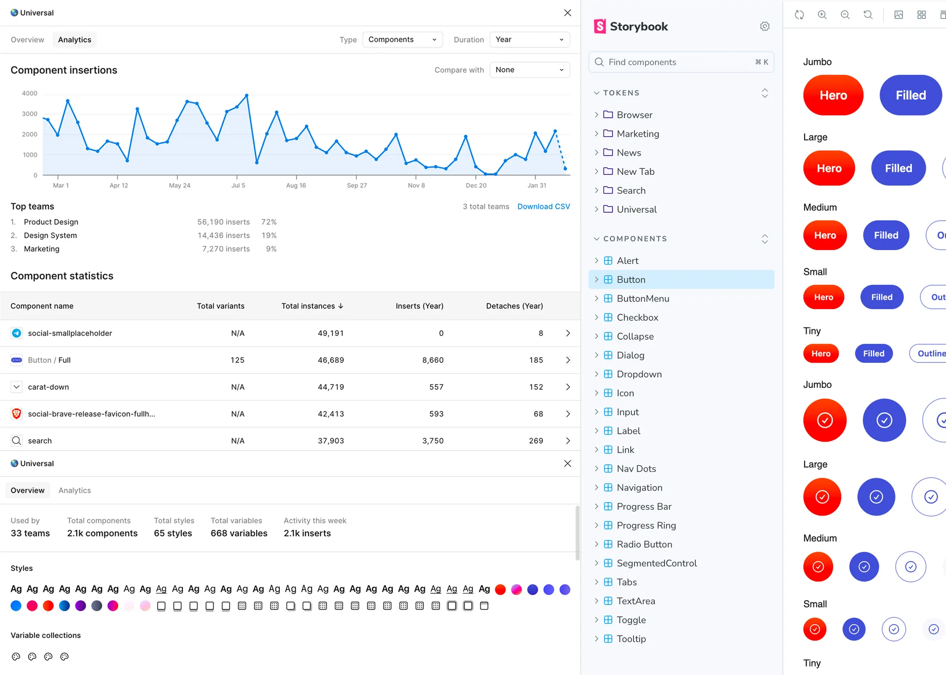
Component documentation is comprehensive and explains both designers and developers how to work with the different variations. I try to make each component as customizable as possible, without it getting incomprehensible.

Nala's Structure
A three-layer approach
Rather than creating a one-size-fits-all solution, I developed a three-level architecture that balanced consistency with flexibility:
Universal foundation
At the core of Nala lies a universal library containing shared elements that maintain consistency across all Brave products:
- A perceptually uniform color system with predictable contrast ratios.
- Typography foundations.
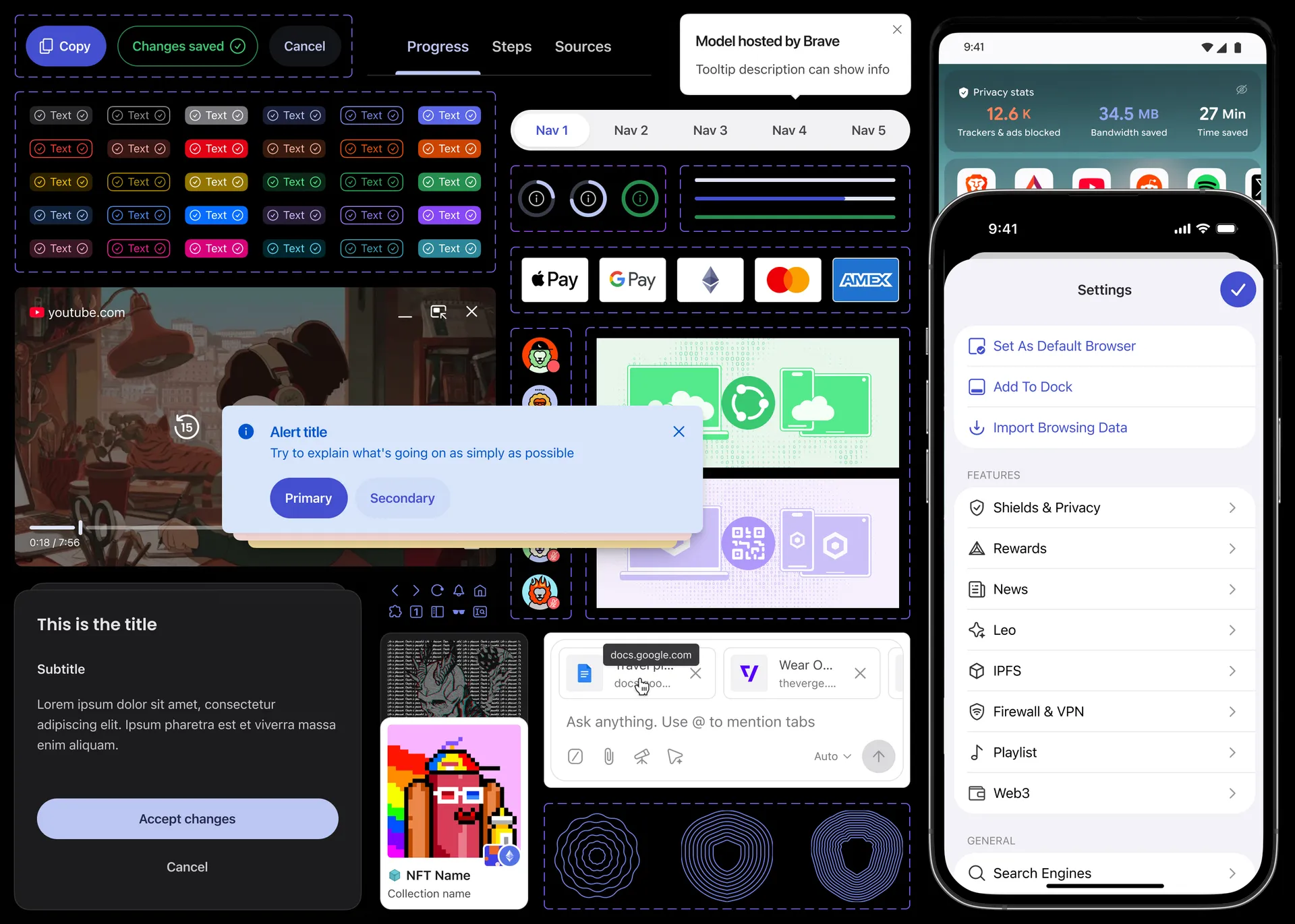
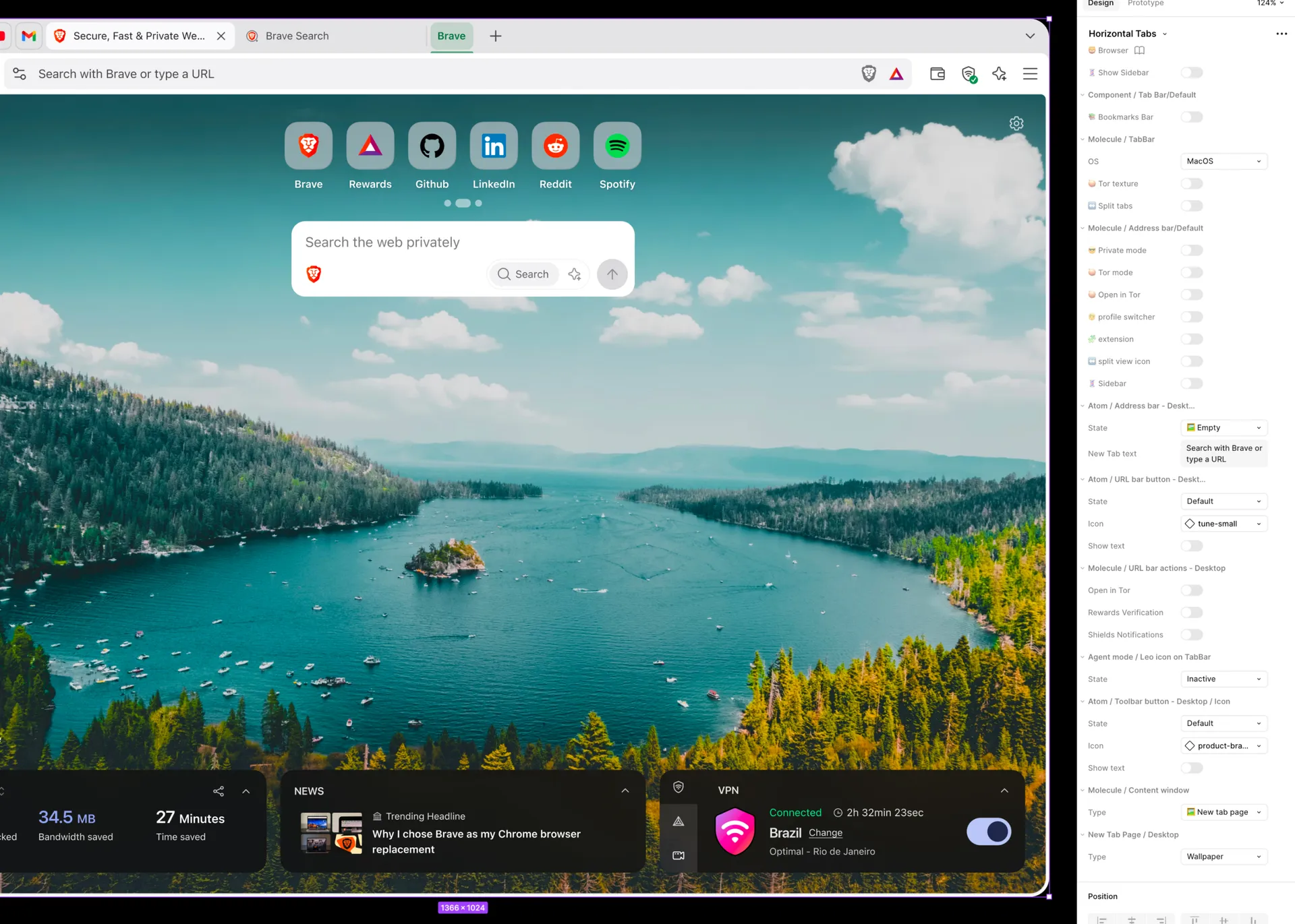
- Basic components (buttons, inputs, tooltips, illustrations, icons, etc.).
Platform libraries
The second layer addresses the unique requirements of different platforms:
- Specific components and patterns for the desktop browser.
- Material Design components and patterns for Android.
- iOS-native design patterns following Human Interface Guidelines.
- Web-specific components.
Feature libraries
The most specific layer enables feature teams to maintain their unique identity and style, while staying in line within the broader design language.
- Custom components for Brave Search.
- Specialized UI patterns for Brave Wallet.
- Unique elements for Brave News and Leo.
Of course, since most of our products live within the browser UI, there's a lot of cross-referencing between the different libraries: Our Wallet, for example, has implementations that live within the browser in all platforms, but also has a web version. So they all have to be in sync and make for a streamlined experience.
Takeaways
Nala's creation and implementation were a critical strategic move, transforming Brave's fragmented design landscape into a cohesive, efficient, and scalable system. This three-layered design system boosted team productivity, reduced design inconsistency, accelerated development, and fostered cross-team collaboration. Nala solved design debt and established a robust foundation, underpinned by custom, token-based architecture, ensuring future product growth maintains a consistent user experience. As the Design System owner and DesignOps Lead, my work positioned Nala as the essential engine driving design consistency and efficiency at Brave.